ECharts Raw Card
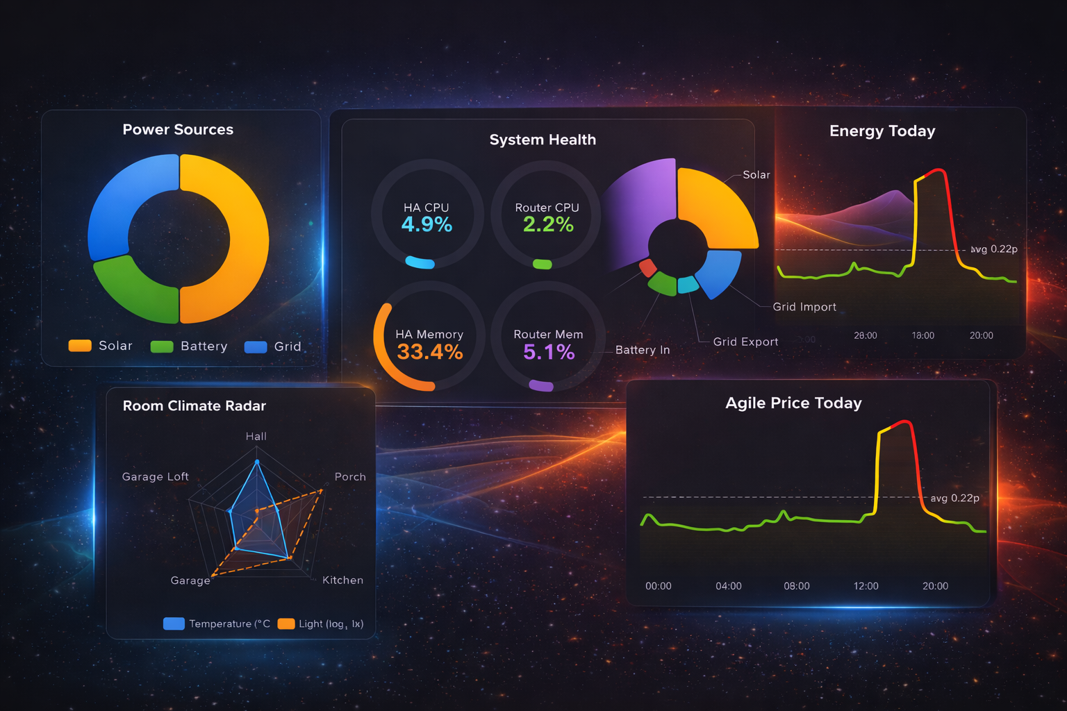
A power-user Home Assistant Lovelace card that renders raw Apache ECharts options — with native entity binding, history queries, transforms, and automatic dark-mode support.
Features
Full Apache ECharts
No abstraction layer — write real ECharts option objects. Gauges, heatmaps, radar, sankey, treemaps, and more.
Live Entity Binding
Bind any HA entity into your chart with $entity tokens. Real-time updates as state changes.
History Queries
Fetch HA history directly with $history. Supports multi-entity, downsampling, and smart caching.
Aggregated Statistics
Use $statistics for daily totals, weekly averages, and cost deltas from HA's long-term statistics API.
Built-in Transforms
Scale, round, clamp, log, sqrt, abs, and offset — apply math transforms inline, no templates needed.
Automatic Dark Mode
Seamlessly switches between light and dark ECharts themes based on your HA UI setting.
Efficient Caching
Smart history caching with configurable TTL. State churn never spams the history API.
Why This Card?
Home Assistant's built-in charts handle basics well — line graphs, bar charts, history graphs. But when you need a radar chart for room climate, a gauge cluster for your UPS, a heatmap of hourly energy usage, or a sankey diagram of power flow — you hit a wall.
Most chart cards invent their own DSL. This card takes a different approach: you write real ECharts option objects, and it resolves Home Assistant data into them. Anything ECharts can render, this card can render — with live data.
option object into your card config and
replace static data with $entity, $data, $history, or $statistics tokens.
Installation
Via HACS (Recommended)
- Open the HACS panel in Home Assistant
- Open the ⋮ menu (top right) → Custom repositories
- Add
https://github.com/rsr5/lovelace-echarts-raw-card— Type: Dashboard - Search for ECharts Raw Card and download it
url: /hacsfiles/lovelace-echarts-raw-card/echarts-raw-card.js
type: module
Manual Installation
- Download
echarts-raw-card.jsfrom the Releases page - Copy it to
/config/www/echarts-raw-card.js - Add the resource:
url: /local/echarts-raw-card.js
type: module
Development
For local development with hot-reload, point HA at your Vite dev server:
url: http://YOUR_LAN_IP:5173/src/index.ts
type: module
Basic Usage
The card accepts any valid ECharts option object.
At minimum you need type: custom:echarts-raw-card and an option key.
type: custom:echarts-raw-card
title: Weekly Stats
height: 320px
option:
  tooltip: {}
  xAxis:
    type: category
    data: [Mon, Tue, Wed, Thu, Fri, Sat, Sun]
  yAxis:
    type: value
  series:
    - type: line
      smooth: true
      data: [150, 230, 224, 218, 135, 147, 260]
That's it. Any option from the ECharts option reference works. Now let's make it dynamic with tokens.
Card Config Reference
| Key | Type | Default | Description |
|---|---|---|---|
option |
object | required | ECharts option object — the chart specification |
title |
string | — | Card title shown above the chart |
height |
string | 300px |
Chart container height (CSS value) |
renderer |
string | canvas |
canvas or svg |
debug |
bool / object | false |
Enable debug output (see Debugging) |
$entity — Live Entity Binding
Bind any Home Assistant entity state (or attribute) into your chart. Place a token object wherever you'd put a static value.
option:
  series:
    - type: gauge
      min: 0
      max: 100
      data:
        - value:
            $entity: sensor.living_room_humidity
            $coerce: number
            $round: 1
          name: Humidity
The card resolves the token at render time, coerces to a number, rounds to 1 decimal, and injects the value. When the entity state changes, the chart updates automatically.
Token Fields
| Field | Type | Description |
|---|---|---|
$entity |
string | Entity ID (required) |
$attr |
string | Read an attribute instead of state |
$coerce |
string | auto, number, string, or bool |
$default |
any | Fallback value if the entity is unavailable |
Transforms
Apply inline math transforms to the resolved value:
| Field | Type | Example | Description |
|---|---|---|---|
$abs |
boolean | true |
Absolute value |
$scale |
number | 0.001 |
Multiply by factor (e.g. W → kW) |
$offset |
number | -273.15 |
Add constant (e.g. Kelvin → Celsius) |
$min |
number | 0 |
Floor clamp |
$max |
number | 100 |
Ceiling clamp |
$clamp |
[min, max] | [0, 100] |
Clamp to range (shorthand for $min + $max) |
$round |
number | 2 |
Round to N decimal places |
$map |
string / object | log |
log, sqrt, or pow mapping |
Transform Example
# Convert mW to kW, clamp 0–10, round to 2 decimals
value:
  $entity: sensor.grid_power
  $coerce: number
  $scale: 0.000001
  $clamp: [0, 10]
  $round: 2
$data — Bulk Entity Extraction
Use $data when you want multiple entities turned into chart data
automatically. Great for pie charts, bar comparisons, or populating axis labels.
option:
  tooltip:
    trigger: item
    formatter: '{b}: {c} W ({d}%)'
  series:
    - type: pie
      radius: [45%, 70%]
      data:
        $data:
          entities:
            - sensor.power_kitchen
            - sensor.power_living_room
            - sensor.power_office
          mode: pairs
          name_from: friendly_name
          coerce: number
          exclude_zero: true
          sort: desc
Modes
| Mode | Output | Use Case |
|---|---|---|
pairs |
{ name, value }[] |
Pie charts, bar charts with labels |
names |
string[] |
Axis category labels |
values |
unknown[] |
Series data arrays |
Options
| Option | Type | Default | Description |
|---|---|---|---|
entities |
array | required | Entity IDs or { id, name } objects |
mode |
string | pairs |
pairs, names, or values |
name_from |
string | friendly_name |
friendly_name or entity_id |
attr |
string | — | Read an attribute instead of state |
coerce |
string | auto |
Type coercion |
default |
any | — | Fallback for unavailable entities |
exclude_unavailable |
boolean | true |
Skip entities that are unavailable/unknown |
exclude_zero |
boolean | false |
Skip entities with value 0 |
sort |
string | none |
asc, desc, or none |
limit |
number | — | Max items to return |
transforms |
object | — | Same transforms as $entity (scale, round, etc.) |
Custom Entity Names
$data:
  entities:
    - id: sensor.living_room_tv_power
      name: TV
    - id: sensor.heater_power
      name: Heater
  mode: pairs
  coerce: number
  exclude_zero: true
$history — Historical Data
Fetch Home Assistant recorder history directly into ECharts. The card handles the API call, data parsing, caching, and throttling.
Single Entity
When you fetch one entity, the output is an array of [timestamp, value] pairs — perfect for a time-series axis.
option:
  xAxis:
    type: time
  yAxis:
    type: value
  series:
    - type: line
      showSymbol: false
      data:
        $history:
          entities:
            - sensor.outdoor_temperature
          hours: 24
          coerce: number
Multi-Entity → Auto Series
When multiple entities are listed, the card can auto-generate one ECharts series per entity.
This replaces the entire series array.
option:
  tooltip:
    trigger: axis
  legend:
    top: 0
  xAxis:
    type: time
  yAxis:
    type: value
    axisLabel:
      formatter: '{value} W'
  series:
    $history:
      entities:
        - id: sensor.solar_power
          name: Solar
        - id: sensor.grid_power
          name: Grid
      hours: 24
      mode: series
      series_type: line
      show_symbol: false
      coerce: number
      sample:
        max_points: 300
method: meanmode is omitted, the card defaults to values for a single entity
and series for multiple entities.
Downsampling
For long time ranges, use sample to reduce data points.
This keeps the chart responsive and reduces memory usage.
$history:
  entities:
    - sensor.energy_usage
  hours: 168  # 7 days
  sample:
    max_points: 300
    method: mean  # or "last"
Per-Series Overrides
Customize individual series when using mode: series.
Keys match the entity's display name or entity ID.
$history:
  entities:
    - sensor.solar_power
    - sensor.grid_power
  mode: series
  series_type: line
  series_overrides:
    Solar:
      areaStyle: {}
      smooth: true
      color: '#f59e0b'
    Grid:
      lineStyle:
        type: dashed
$history Options Reference
| Option | Type | Default | Description |
|---|---|---|---|
entities |
array | required | Entity IDs or { id, name } objects |
hours |
number | 24 |
Hours of history to fetch |
start / end |
string | number | — | Explicit time range override (ISO string or epoch ms); takes precedence over hours |
mode |
string | auto | values or series |
attr |
string | — | Read an attribute instead of state from each history point |
coerce |
string | number |
Type coercion for values |
default |
any | — | Value plotted for unavailable/unparseable states. Without it, those points become gaps |
series_type |
string | line |
line, bar, or scatter |
show_symbol |
boolean | false |
Show data point markers |
sample |
object | — | { max_points, method } for downsampling |
cache_seconds |
number | 30 |
How long to cache the API response |
series_overrides |
object | — | Per-series ECharts overrides keyed by name |
transforms |
object | — | Apply transforms to values (scale, round, etc.) |
name_from |
string | friendly_name |
How to label series |
$statistics — Aggregated Statistics
Fetch pre-computed statistics from Home Assistant's long-term statistics API.
Unlike $history (which returns every recorded state change), $statistics
returns aggregated buckets — one value per hour, day, week, or month — with proper
delta handling via stat_type: change.
$statistics vs $history$statistics for aggregated/bucketed data — daily totals, hourly averages, cost deltas, monthly summaries.Use
$history for raw time-series — live traces, minute-by-minute sensor readings.
Daily bar chart
A single entity producing [timestamp, value] pairs — perfect for xAxis: { type: time }.
option:
  xAxis:
    type: time
  yAxis:
    type: value
    name: "£"
  series:
    - type: bar
      data:
        $statistics:
          entities:
            - sensor.daily_energy_cost
          period: day
          stat_type: change
          days: 14
Multi-entity series
Multiple entities with mode: series — the card generates one ECharts series per entity,
just like $history multi-entity mode.
option:
  xAxis:
    type: time
  yAxis:
    type: value
  series:
    $statistics:
      entities:
        - sensor.solar_production
        - sensor.grid_import
      period: day
      stat_type: change
      days: 30
      mode: series
      series_type: bar
Pie / donut aggregation
Use mode: pairs to get { name, value } objects — ideal for pie charts, treemaps, and bar-by-category charts.
Each entity becomes one data point with its total summed across the requested period.
option:
  series:
    - type: pie
      radius: ["40%", "70%"]
      data:
        $statistics:
          entities:
            - sensor.power_kitchen
            - sensor.power_office
            - sensor.power_hvac
          period: day
          stat_type: sum
          days: 7
          mode: pairs
Per-series overrides
$statistics:
  entities:
    - sensor.solar_production
    - sensor.grid_import
  period: day
  stat_type: change
  days: 30
  mode: series
  series_overrides:
    Solar Production:
      color: "#4caf50"
      areaStyle: {}
    Grid Import:
      color: "#f44336"
$statistics Options Reference
| Field | Type | Default | Description |
|---|---|---|---|
entities |
string[] | (required) | One or more Home Assistant entity IDs |
period |
string | day |
5minute · hour · day · week · month |
stat_type |
string | change |
mean · min · max · sum · change · state |
days |
number | 14 |
How many days of statistics to fetch |
start / end |
string | number | — | Explicit time range override (ISO string or epoch ms) |
mode |
string | auto | values (1 entity → [ts, val][]), series (→ ECharts series[]), pairs (→ {name, value}[]) |
name_from |
string | friendly_name |
friendly_name or entity_id |
series_type |
string | bar |
line · bar · scatter (used in series mode) |
cache_seconds |
number | 300 |
Cache TTL — statistics don't change fast (5 min default) |
series_overrides |
object | — | Per-series ECharts overrides keyed by name |
Caching & Performance
The card is designed to be efficient out of the box:
- History caching — API responses are cached for
cache_seconds(default 30). No redundant fetches. - Statistics caching — Statistics responses are cached separately with a longer TTL (default 300s / 5 min).
- LRU eviction — The cache stores the most recent 100 unique queries. Old entries are evicted automatically.
- Throttled re-fetches — State changes don't spam the history API. Re-fetches respect the cache TTL.
- Downsampling — Use
sample.max_pointsto keep large datasets from slowing down rendering.
cache_seconds to 60–120 to reduce API load.
$history:
  entities: [sensor.energy]
  hours: 48
  cache_seconds: 120
  sample:
    max_points: 200
    method: mean
Dark Mode
The card automatically detects your Home Assistant UI theme and switches
between ECharts' default (light) and dark themes. No configuration required.
This applies to text color, grid lines, tooltip styling, and legend colors — charts look native in both light and dark dashboards.
Debugging
When charts don't look right, enable debug mode to see exactly what the card sends to ECharts.
Quick Enable
type: custom:echarts-raw-card
debug: true
option:
  ...
Fine-Grained Debug
type: custom:echarts-raw-card
debug:
  show_resolved_option: true   # Shows resolved JSON in the card
  log_resolved_option: true    # Logs to browser console
  max_chars: 20000             # Safety limit for JSON text
option:
...console.debug() output.
In Chrome, set the console log level to Verbose to see debug messages.
What Debug Shows
- The fully resolved ECharts option after all
$entity,$data,$history, and$statisticstokens are replaced - Helpful for verifying that entities resolved correctly, transforms applied properly, and history data arrived
Troubleshooting
⚠️ "My chart is blank" — JavaScript functions in YAML
This is the #1 gotcha. Many ECharts examples on the web use JavaScript
functions — formatter: (params) => ..., symbolSize: function (val) ....
Home Assistant YAML cannot express real functions: they arrive as strings,
and ECharts fails silently, often rendering nothing at all.
The card detects this and shows a warning listing exactly where the functions are.
Replace them with ECharts string templates
(e.g. formatter: "{b}: {c} W") or move the math into a
token transform.
Chart is blank after switching views or on first load
- Make sure you're on the latest release — older versions could stay blank after Lovelace re-attached the card (fixed since v1.0.5).
- Enable
debug: trueand check the resolved option — ifseries.datais empty, the problem is the query, not the render. - Check the browser console for
[echarts-raw-card]errors.
Unavailable entities
$entity— resolves to$defaultwhen the entity is missing; states likeunavailableresolve to$defaulttoo when a numeric coercion fails.$data— unavailable/unknown entities are skipped by default; setexclude_unavailable: falseto keep them.$history— unavailable periods become gaps in the line. Setdefault: 0if you'd rather plot a value.$coerce: bool—unavailable/unknowncoerce tofalse, nevertrue.
History looks stale
History and statistics responses are cached (cache_seconds, default 30 for
$history, 300 for $statistics). Lower it if you need fresher data,
raise it to reduce API load on busy dashboards.
Still stuck?
Open an issue on
GitHub
with your card YAML and the debug output — the resolved option from
debug: true makes most problems obvious.
Chart Ideas — Beyond Line & Bar
The whole point of this card is unlocking chart types that HA can't do natively. Here are some ideas to get you started. Each one links to the ECharts example that inspired it.
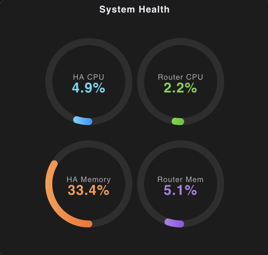
🌡️ Gauge Cluster — System Health
Modern ring-style gauges with gradient fills and animated progress arcs. Four gauges in one card — something HA's native gauge card can't do.
type: custom:echarts-raw-card
height: 440px
option:
  title:
    text: System Health
    left: center
    top: 4
  series:
    - type: gauge
      name: HA CPU
      center: ["33%", "32%"]
      radius: "34%"
      min: 0
      max: 100
      startAngle: 270
      endAngle: -90
      itemStyle:
        color:
          type: linear
          x: 0
          y: 0
          x2: 1
          y2: 0
          colorStops:
            - offset: 0
              color: "#58d9f9"
            - offset: 1
              color: "#1890ff"
      progress:
        show: true
        width: 12
        roundCap: true
      axisLine:
        lineStyle:
          width: 12
          color:
            - [1, "rgba(255,255,255,0.08)"]
      axisTick:
        show: false
      splitLine:
        show: false
      axisLabel:
        show: false
      pointer:
        show: false
      anchor:
        show: false
      title:
        offsetCenter: [0, "-10%"]
        fontSize: 13
        color: "#aaa"
      detail:
        valueAnimation: true
        formatter: "{value}%"
        offsetCenter: [0, "15%"]
        fontSize: 24
        fontWeight: bold
        color: "#58d9f9"
      data:
        - name: HA CPU
          value:
            $entity: sensor.localhost_cpu_usage
            $coerce: number
            $round: 1
    # … repeat for Router CPU (green), HA Memory (orange),
    #   Router Memory (purple) with center offsets:
    #   ["67%","32%"], ["33%","72%"], ["67%","72%"]
Full four-gauge config: examples/infra-health-dashboard.yaml
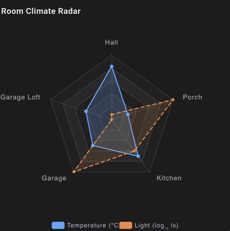
🕸️ Radar — Room Climate Comparison
Compare temperature and light levels across rooms on a single radar chart.
Uses $map: log to compress the wide lux range onto the same scale as temperature.
ECharts radar →
type: custom:echarts-raw-card
height: 480px
option:
  title:
    text: Room Climate Radar
    left: 12
    top: 8
  legend:
    bottom: 0
    data:
      - Temperature (°C)
      - "Light (log\u2081\u2080 lx)"
  radar:
    indicator:
      - name: Hall
        max: 25
      - name: Porch
        max: 25
      - name: Kitchen
        max: 25
      - name: Garage
        max: 25
      - name: Garage Loft
        max: 25
  series:
    - type: radar
      name: Temperature (°C)
      symbol: circle
      symbolSize: 6
      lineStyle:
        width: 2
      areaStyle:
        opacity: 0.15
      data:
        - name: Temperature (°C)
          value:
            - $entity: sensor.hall_motion_sensor_temperature
              $coerce: number
              $clamp: [0, 25]
            - $entity: sensor.porch_sensor_temperature
              $coerce: number
              $clamp: [0, 25]
            - $entity: sensor.kitchen_sensor_temperature
              $coerce: number
              $clamp: [0, 25]
            - $entity: sensor.garage_motion_sensor_temperature
              $coerce: number
              $clamp: [0, 25]
            - $entity: sensor.garage_loft_sensor_temperature
              $coerce: number
              $clamp: [0, 25]
    - type: radar
      name: "Light (log\u2081\u2080 lx)"
      symbol: diamond
      symbolSize: 6
      lineStyle:
        width: 2
        type: dashed
      areaStyle:
        opacity: 0.12
      data:
        - name: "Light (log\u2081\u2080 lx)"
          value:
            - $entity: sensor.hall_motion_sensor_illuminance
              $coerce: number
              $map: log
              $clamp: [0, 25]
            - $entity: sensor.porch_sensor_illuminance
              $coerce: number
              $map: log
              $clamp: [0, 25]
            - $entity: sensor.kitchen_sensor_illuminance
              $coerce: number
              $map: log
              $clamp: [0, 25]
            - $entity: sensor.garage_motion_sensor_illuminance
              $coerce: number
              $map: log
              $clamp: [0, 25]
            - $entity: sensor.garage_loft_sensor_illuminance
              $coerce: number
              $map: log
              $clamp: [0, 25]
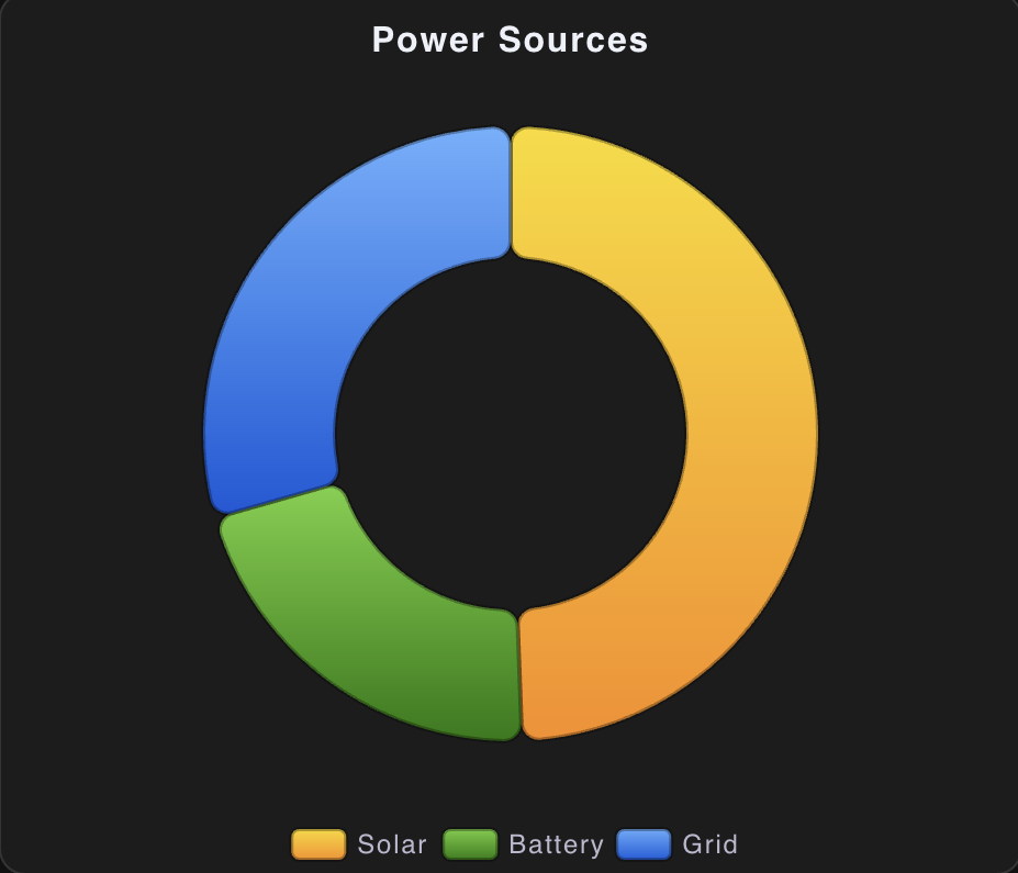
🍩 Donut — Power Source Breakdown
Live donut showing where your electricity is coming from right now. Gradient fills and rounded segments give it a modern look. Hover for kW values and percentages.
type: custom:echarts-raw-card
height: 400px
option:
  title:
    text: Power Sources
    left: center
    top: 8
  tooltip:
    trigger: item
    formatter: "{b}: {c} kW ({d}%)"
  legend:
    bottom: 0
    data: [Solar, Battery, Grid]
  series:
    - type: pie
      radius: ["40%", "70%"]
      center: ["50%", "50%"]
      itemStyle:
        borderRadius: 8
        borderColor: "rgba(0,0,0,0.3)"
        borderWidth: 2
      label:
        show: false
      emphasis:
        label:
          show: false
        itemStyle:
          shadowBlur: 10
      data:
        - name: Solar
          value:
            $entity: sensor.home_solar_power
            $coerce: number
            $round: 2
          itemStyle:
            color:
              type: linear
              colorStops:
                - { offset: 0, color: "#fadb14" }
                - { offset: 1, color: "#fa8c16" }
        - name: Battery
          value:
            $entity: sensor.home_battery_power
            $coerce: number
            $round: 2
          itemStyle:
            color:
              type: linear
              colorStops:
                - { offset: 0, color: "#73d13d" }
                - { offset: 1, color: "#237804" }
        - name: Grid
          value:
            $entity: sensor.home_grid_power
            $coerce: number
            $round: 2
          itemStyle:
            color:
              type: linear
              colorStops:
                - { offset: 0, color: "#69b1ff" }
                - { offset: 1, color: "#0958d9" }
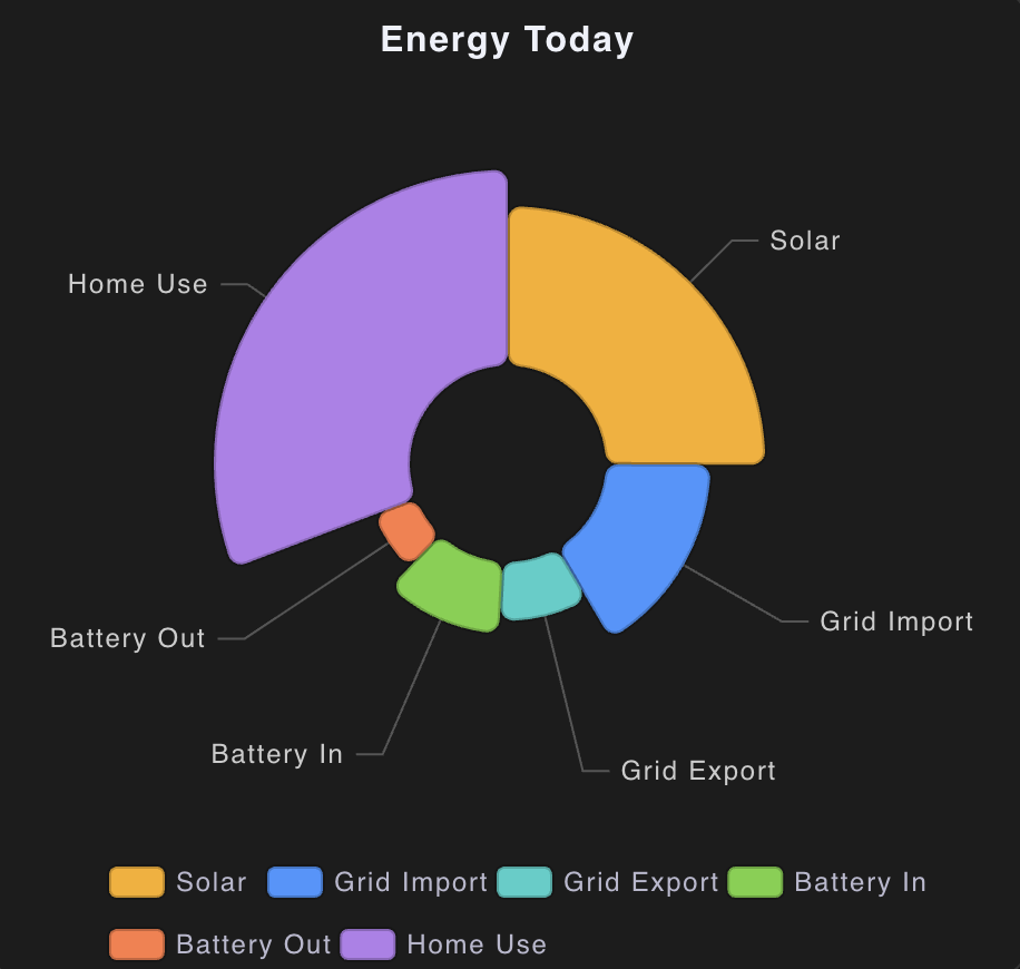
🌸 Nightingale Rose — Energy Breakdown
A polar bar chart where petal length represents kWh. Instantly see which energy category dominates your day.
type: custom:echarts-raw-card
height: 440px
option:
  title:
    text: Energy Today
    left: center
    top: 8
  tooltip:
    trigger: item
    formatter: "{b}: {c} kWh"
  legend:
    bottom: 0
    itemGap: 12
  series:
    - type: pie
      roseType: radius
      radius: ["20%", "60%"]
      center: ["50%", "48%"]
      itemStyle:
        borderRadius: 6
        borderColor: "rgba(0,0,0,0.2)"
        borderWidth: 2
      label:
        show: true
        position: outside
        formatter: "{b}"
        fontSize: 12
      emphasis:
        itemStyle:
          shadowBlur: 12
      data:
        - name: Solar
          value:
            $entity: sensor.home_solar_generated
            $coerce: number
            $round: 1
          itemStyle:
            color: "#faad14"
        - name: Grid Import
          value:
            $entity: sensor.home_grid_imported
            $coerce: number
            $round: 1
          itemStyle:
            color: "#4096ff"
        - name: Grid Export
          value:
            $entity: sensor.home_grid_exported
            $coerce: number
            $round: 1
          itemStyle:
            color: "#36cfc9"
        - name: Battery In
          value:
            $entity: sensor.home_battery_charged
            $coerce: number
            $round: 1
          itemStyle:
            color: "#73d13d"
        - name: Battery Out
          value:
            $entity: sensor.home_battery_discharged
            $coerce: number
            $round: 1
          itemStyle:
            color: "#ff7a45"
        - name: Home Use
          value:
            $entity: sensor.home_home_usage
            $coerce: number
            $round: 1
          itemStyle:
            color: "#b37feb"
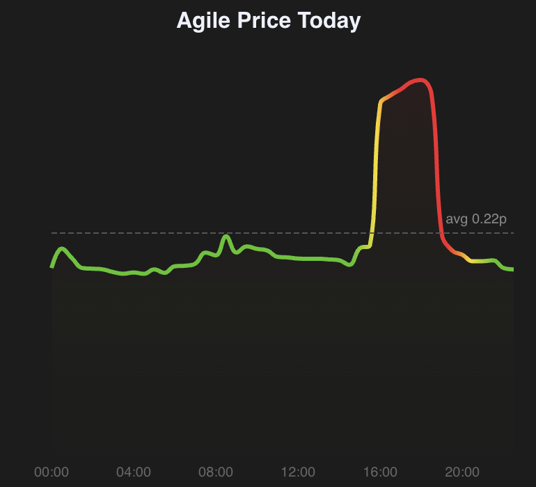
⚡ Agile Pricing — Daily Rate Chart
Smooth area chart of Octopus Agile half-hourly rates with a colour gradient that turns red during peak pricing. Uses a HA template sensor to pre-process the rate data.
Step 1 — Template sensor helper
Add this to your configuration.yaml (replace the event entity ID with your own):
# configuration.yaml
template:
  - sensor:
      - name: "Agile Rates Today"
        state: >
          {{ state_attr('event.octopus_energy_electricity_SERIAL_MPAN_current_day_rates', 'rates') | length }}
        attributes:
          times: >
            {% set rates = state_attr('event.octopus_energy_electricity_SERIAL_MPAN_current_day_rates', 'rates') %}
            {{ rates | map(attribute='start') | map('as_timestamp') | map('timestamp_custom', '%H:%M') | list }}
          prices: >
            {% set rates = state_attr('event.octopus_energy_electricity_SERIAL_MPAN_current_day_rates', 'rates') %}
            {{ rates | map(attribute='value_inc_vat') | list }}
          average: >
            {% set rates = state_attr('event.octopus_energy_electricity_SERIAL_MPAN_current_day_rates', 'rates') %}
            {{ (rates | map(attribute='value_inc_vat') | list | average) | round(4) }}
Step 2 — Card config
type: custom:echarts-raw-card
height: 360px
option:
  title:
    text: Agile Price Today
    left: center
    top: 8
  tooltip:
    trigger: axis
    backgroundColor: "rgba(30,30,30,0.9)"
    borderColor: transparent
  grid:
    left: 40
    right: 20
    top: 44
    bottom: 28
  xAxis:
    type: category
    boundaryGap: false
    data:
      $entity: sensor.agile_rates_today
      $attr: times
    axisLabel:
      fontSize: 10
      color: "#666"
      interval: 7
    axisLine:
      show: false
    axisTick:
      show: false
  yAxis:
    type: value
    show: false
  series:
    - type: line
      smooth: 0.4
      symbol: none
      lineStyle:
        width: 3
        color:
          type: linear
          x: 0
          y: 0
          x2: 1
          y2: 0
          colorStops:
            - { offset: 0, color: "#52c41a" }
            - { offset: 0.65, color: "#52c41a" }
            - { offset: 0.7, color: "#fadb14" }
            - { offset: 0.75, color: "#f5222d" }
            - { offset: 0.85, color: "#f5222d" }
            - { offset: 0.9, color: "#fadb14" }
            - { offset: 0.95, color: "#52c41a" }
      areaStyle:
        opacity: 0.15
        color:
          type: linear
          x: 0
          y: 0
          x2: 0
          y2: 1
          colorStops:
            - { offset: 0, color: "rgba(245,34,34,0.4)" }
            - { offset: 1, color: "rgba(82,196,26,0.02)" }
      markLine:
        silent: true
        symbol: none
        lineStyle:
          type: dashed
          color: "#555"
        data:
          - yAxis:
              $entity: sensor.agile_rates_today
              $attr: average
              $coerce: number
            label:
              formatter: "avg {c}p"
              fontSize: 10
              color: "#888"
      data:
        $entity: sensor.agile_rates_today
        $attr: prices
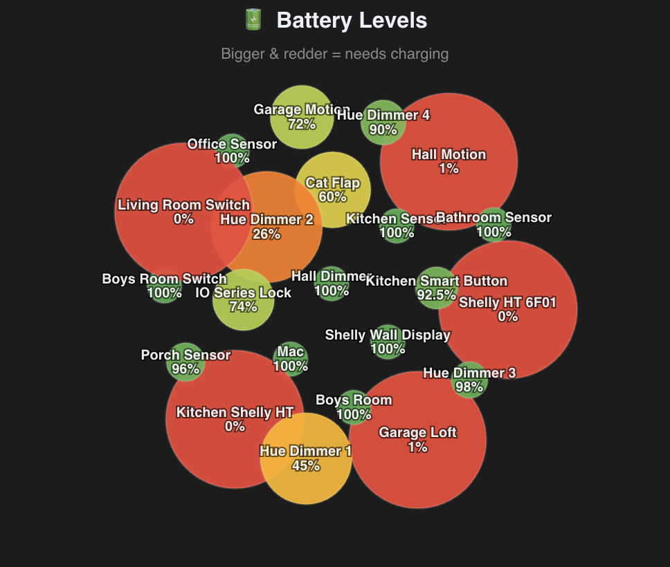
🔋 Battery Bubbles — Force-Clustered Battery Levels
A force-directed graph where each bubble is a battery sensor.
visualMap drives both size and colour — low batteries
swell and turn red, healthy ones shrink and stay green.
Uses $data in pairs mode so the list stays DRY.
ECharts force graph →
type: custom:echarts-raw-card
height: 600px
option:
  title:
    text: Battery Levels
    left: center
    top: 8
  tooltip:
    formatter: "{b}: {c}%"
  visualMap:
    show: true
    min: 0
    max: 100
    orient: horizontal
    left: center
    bottom: 8
    text: ["Full", "Empty"]
    inRange:
      color: ["#f5222d", "#fa8c16", "#fadb14", "#52c41a"]
      symbolSize: [100, 25]
  series:
    - type: graph
      layout: force
      force:
        repulsion: 420
        gravity: 0.15
        edgeLength: 50
      roam: true
      label:
        show: true
        formatter: "{b}\n{c}%"
        fontSize: 10
      data:
        $data:
          entities:
            - sensor.kitchen_motion_sensor_battery
            - sensor.front_door_sensor_battery
            # … add your battery entities here
          mode: pairs
          coerce: number